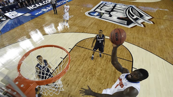
For the 6th time in Florida Basketball history, the Gators are off to the Final Four. Over the years, the logos for the Final Four have gone from quirky and iconic to streamlined and minimalistic.
As best we can, we are going to rank the six logos Florida has been a part of over the years.
Florida Basketball Logos: No.6 - 2006

When you look through all the logos in the 2000s, most of them are solid, with some bordering on iconic. The 2005 logo in St. Louis is amazing, and the 2007 one, which we will get to, is great as well.
But the 2006 logo might be as forgettable as they come. There is nothing in the logo that screams Indianapolis, and one could have slapped any city in America on the logo, and it still would have fit.
No. 5 - 2014

Maybe it's because of how the 2014 Final Four went down, but the mono-color, all-silver logo just doesn't work as a great logo.
It at least tries to represent something, and it is an outline of the roof of AT&T Stadium, AKA Jerry World, but it just feels messy and flat at the same time.
No. 4 - 2025
The #Final4 is set for San Antonio. Who will take home this year's title? #Duke #Houston #Florida or #Auburn? pic.twitter.com/Tnii2NEtpe
— Starcade Media (@StarcadeMediaKC) March 30, 2025
This year's logo follows the trend of Final Four logos that the Super Bowl has also followed of minimalistic logos that struggle to stand out from each other.
It's clean enough with enough color to hop over the 2006 and 2014 logos, but nothing in this logo screams "San Antonio" and there is a considerable gap between this year and the remaining three logos.
No. 3 - 2000

A logo that screams the year 2000, this edition featured the Indianapolis skyline with the old RCA Dome.
It's not necessarily "clean" like the 2025 logo, but it has a charm to it that these modern logos are never going to be able to match.
No. 2 - 2007

The 2007 Atlanta logo was a reminder that you can have a simple logo while still representing the host in a way that stands out.
Fun fact: the 2007 logo was the first Final Four logo since 1989 to not feature an actual basketball in it. But the peach outline was well done and a reminder how these logos should look.
No. 1 - 1994
FLORIDA MEN'S BASKETBALL 1994 FINAL FOUR SHOOTING SHIRThttps://t.co/JejKqGGXpr pic.twitter.com/x72IteuvgP
— Homefield (@HomefieldApparl) March 13, 2025
Call it nostalgia, call it favoritism for it being Florida's first Final Four, or call it liking colorful stuff, but the 1994 logo is the perfect blend of color that pops while somehow not going over the top and keeping things clean.
This logo has a lot going on but still manages to never be too much on the eye.
